UI/UX Revision
- Visual -
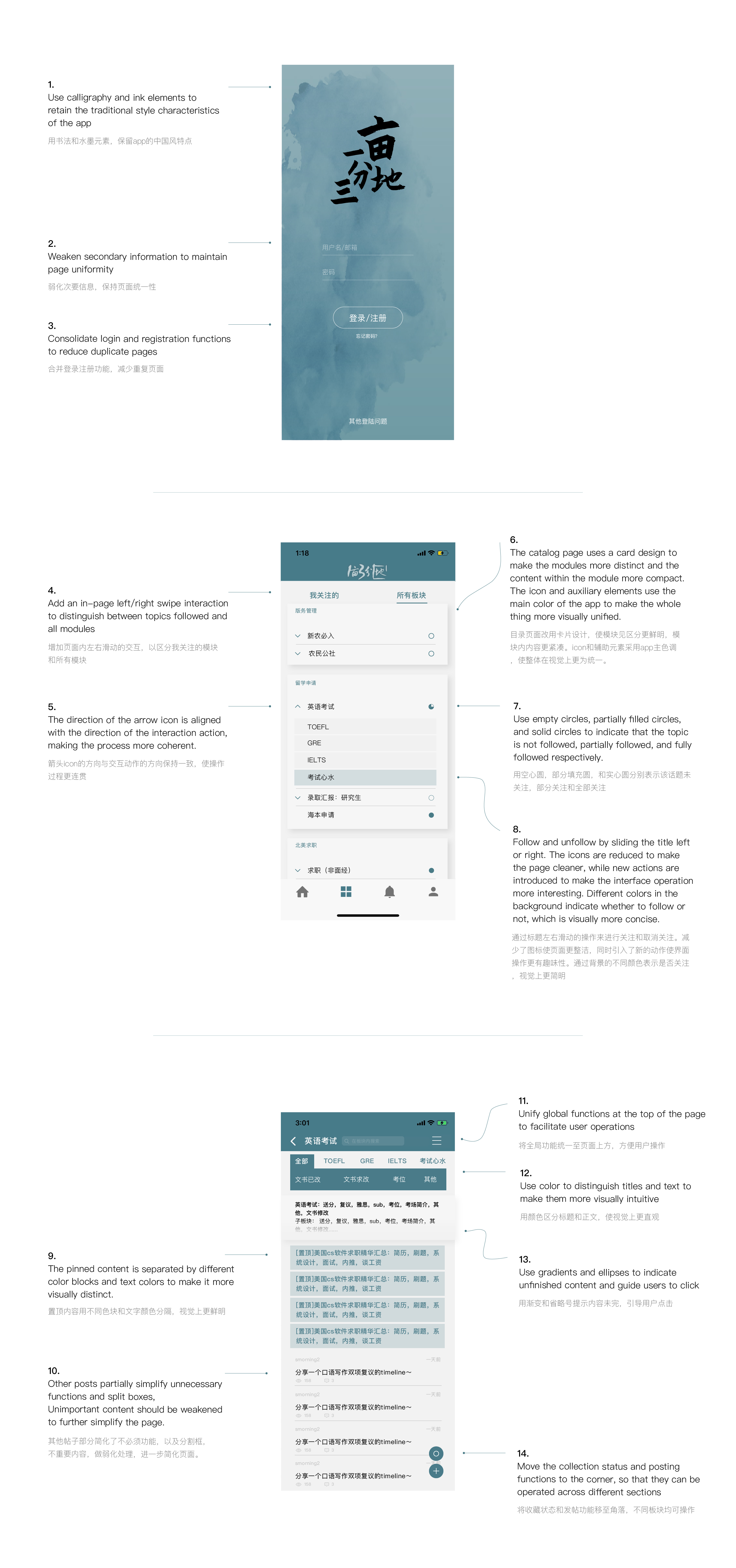
- From the app icon to the landing page, including the icons within the app, the design style of the function segmentation is slightly outdated. Especially on the registration page, it's good to keep the Chinese ink style, but the inappropriate brush strokes not only affect the viewing experience but also disconnect with the whole page style.
- The overall color of the app is messy. Although all the colors used are neutral black, white and grey except for the main dark green color, the problem is that the main color is not used in the details, which makes the app as a whole not presentable for the design style. For example, the loading button, the error alert box, and all the icons on the personal page can be unified into the main body's dark green color, although the change is very small, it will present a completely different outcome.
- Messy font size. As a text-based app, the presentation of text seems a bit messy. This is mainly reflected in the fact that the body text has a slightly larger font size and a slightly narrower spacing, which makes it inconvenient to read. The priority of the content does not match the size and thickness of the text, and some unimportant texts are not differentiated by a slightly larger font size or color.
- User Experience -
- The forum title page shows too much information, such as the poster's name, avatar, tags, but these are not the most important things that users need to pay attention to, and all of them will appear to be a very cluttered page.
- The title categories are too detailed, and the arrangement is not concise enough, which increases the user's cost.
- The functional partitions are not distinct enough.
- Functional partitions are not clear enough. For example, in the page of faculty introduction, it is divided into a directory module, search module, notification module, top post and general post, which should be visually divided according to different functions to enhance the user's efficiency and experience, but now it is difficult for people to make a distinction at a glance.